Ehsan & Co. LLC.

Better, together! A fresh take for creating meaningful connections in familiar places

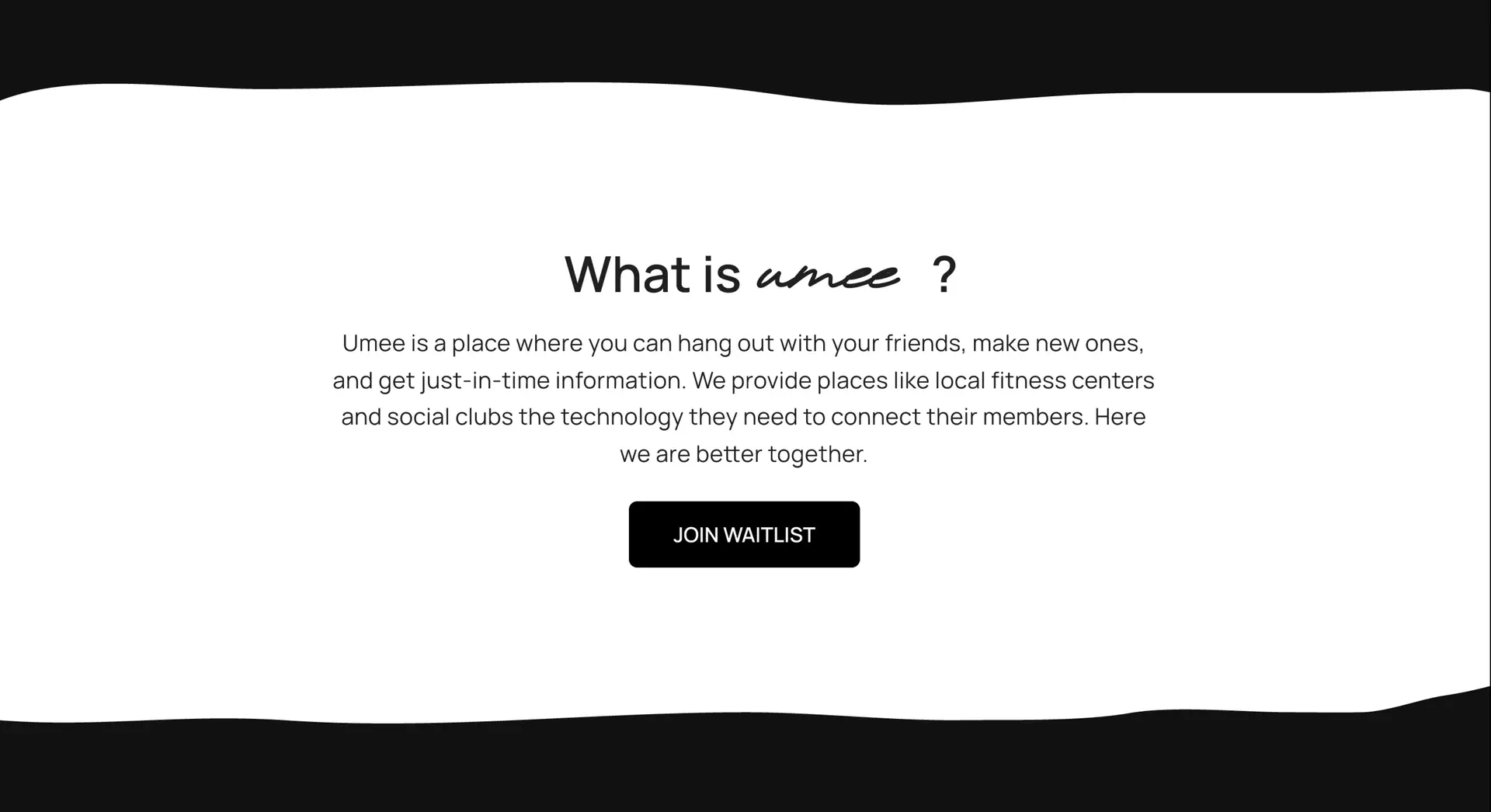
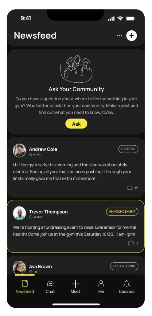
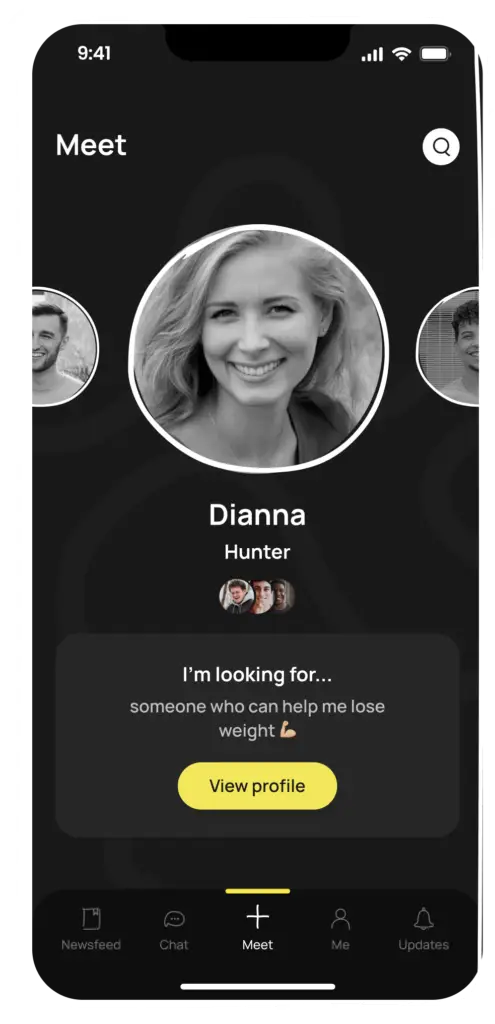
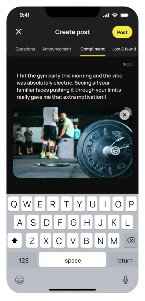
With a global team that is a community in itself, Ehsan & Co. LLC. is developing Umee, an app aimed at fostering lasting friendships within the fitness centres people already call home. Drawing on research from the U.S. Surgeon General and insights from Harvard's Dr. Waldinger, “Umee” is designed to empower individuals to build relationships that contribute to longer, healthier, and happier lives, focusing on real people, real conversations, and real connections. Umee encourages users to get to know the familiar faces they see every day, welcome newcomers, and stay informed about activities and events within their fitness community. Whether someone is looking to offer support, seek advice, or simply strengthen their sense of belonging, Umee makes it easier than ever to connect and support one another. At its core, Umee prioritises respectful and meaningful connections, providing a safe space for genuine in-person interactions. By promoting collaboration and community building, Umee creates an environment where everyone can feel more connected and engaged.

Scope: Creative Direction, Brand Identity, Web Design, App Design

Area: Social impact, Community building

Location: Washington D.C., USA
www.umee.social

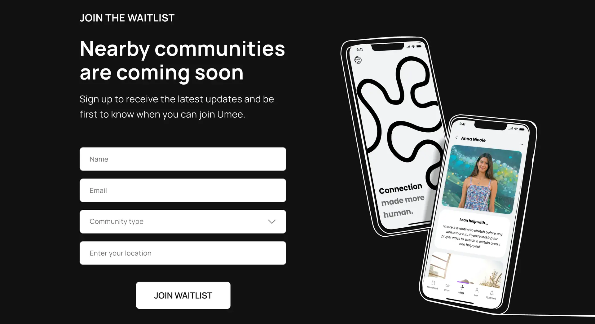
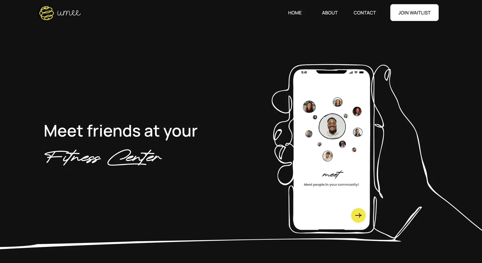
In my role as Design Lead at Ehsan & Co. LLC, I have contributed to the development of the Umee website, the ongoing improvement of the app design from its early MVP stage, while also working on the brand’s visual identity. The brand’s visual language focuses on creating a distinct product that stands apart from other social media platforms and startups, using imagery and illustrations that convey a sense of inclusive exclusivity and a human-centred approach.

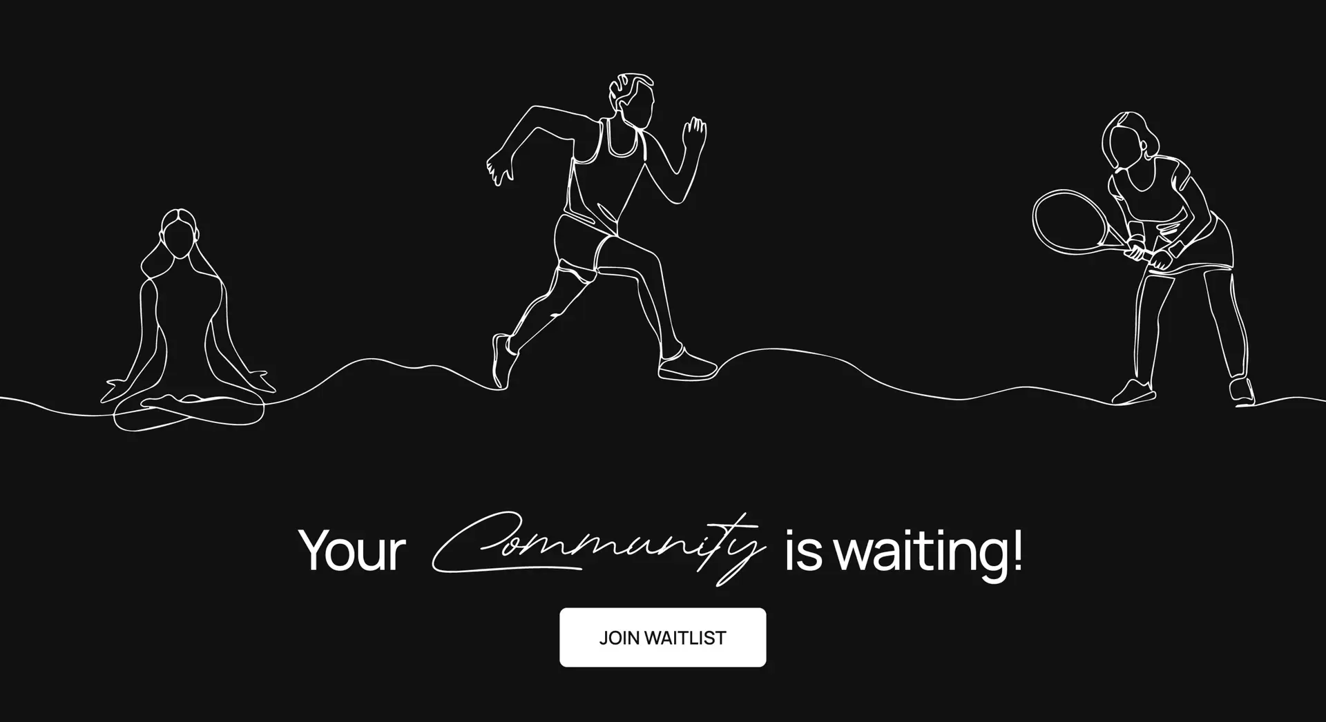
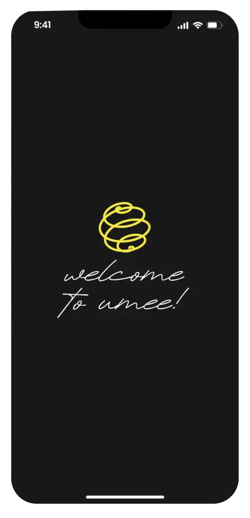
The website reflects the spirit of the app, merging the ideas of inclusivity and exclusivity to create a harmonious experience. We employed elegant contrasts and timeless typography to enhance the sophisticated feel that Umee aims for, while the presence of an accent colour strikes a balance between exclusivity and a friendly, welcoming touch. To symbolise the continuous effort that friendships require, we drew inspiration from one-line hand-drawn illustrations, adding a personal touch to the design. Careful attention has been paid to details, including custom icons that maintain the same hand-drawn style, reinforcing the overall concept. Our goal has been to ensure that every aspect of the app is meaningful without compromising style and practicality.

Better

Together

Want to work on your next project together?

For new project enquiries, please get in touch at jac@pucastudio.com